UI/UX Design
Student Designer
5 Week Turnaround
Family Pride Pay Case Study
Family Pride Laundries offers laundry solutions for multi-unit housing facilities across the midwest. It’s dedicated app, Family Pride Pay, allows for users to digitally pay for their laundry, track their cycles, and report problems with machines.
User Personas
Terry (85) is a retiree who lives in an apartment complex in Rockford, IL with his wife and pet dog.
Goal: To use the laundry app to pay for laundry, keep track of which machines he is using, and track the length of each cycle.
Frustration: Since Terry has bad eyesight and often doesn't wear his glasses, a lot of the text is too small for him to read–especially the text pertaining to which machines he is using and the time remaining on his cycles. Since he has been unable to adapt to technology at the level of younger generations, he often struggles with the navigation of the app.

Bella (24) is an X-ray technician who lives with her partner in a high-rise apartment building in Chicago, IL.
Goal: To use Family Pride Pay in order to do her laundry as time efficiently as possible.
Frustration: Bella doesn't like standing around and waiting while using the app, as she feels that she is wasting precious time that should be going towards decompressing from her stressful job.
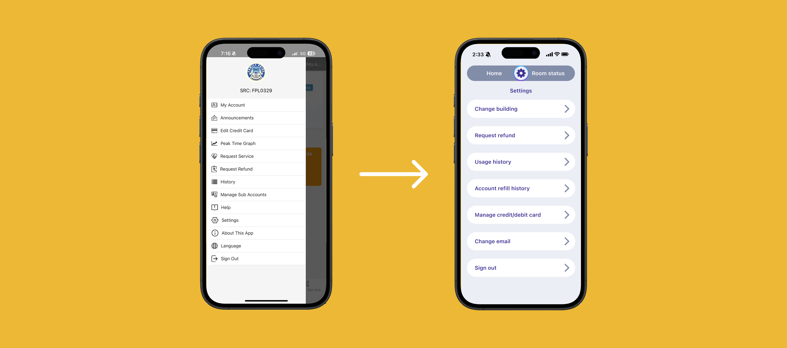
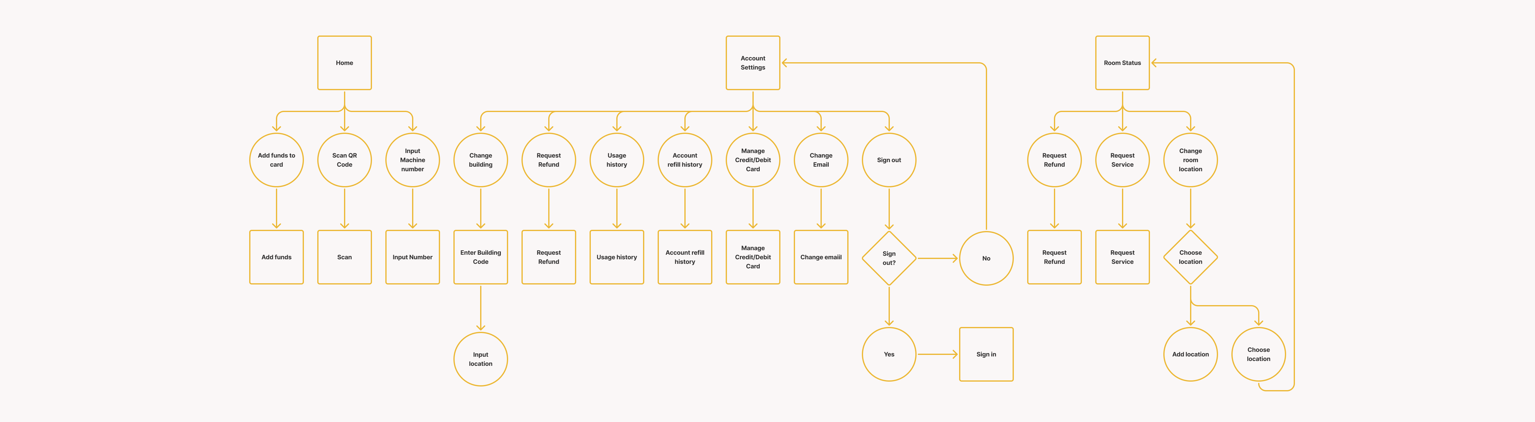
Navigation
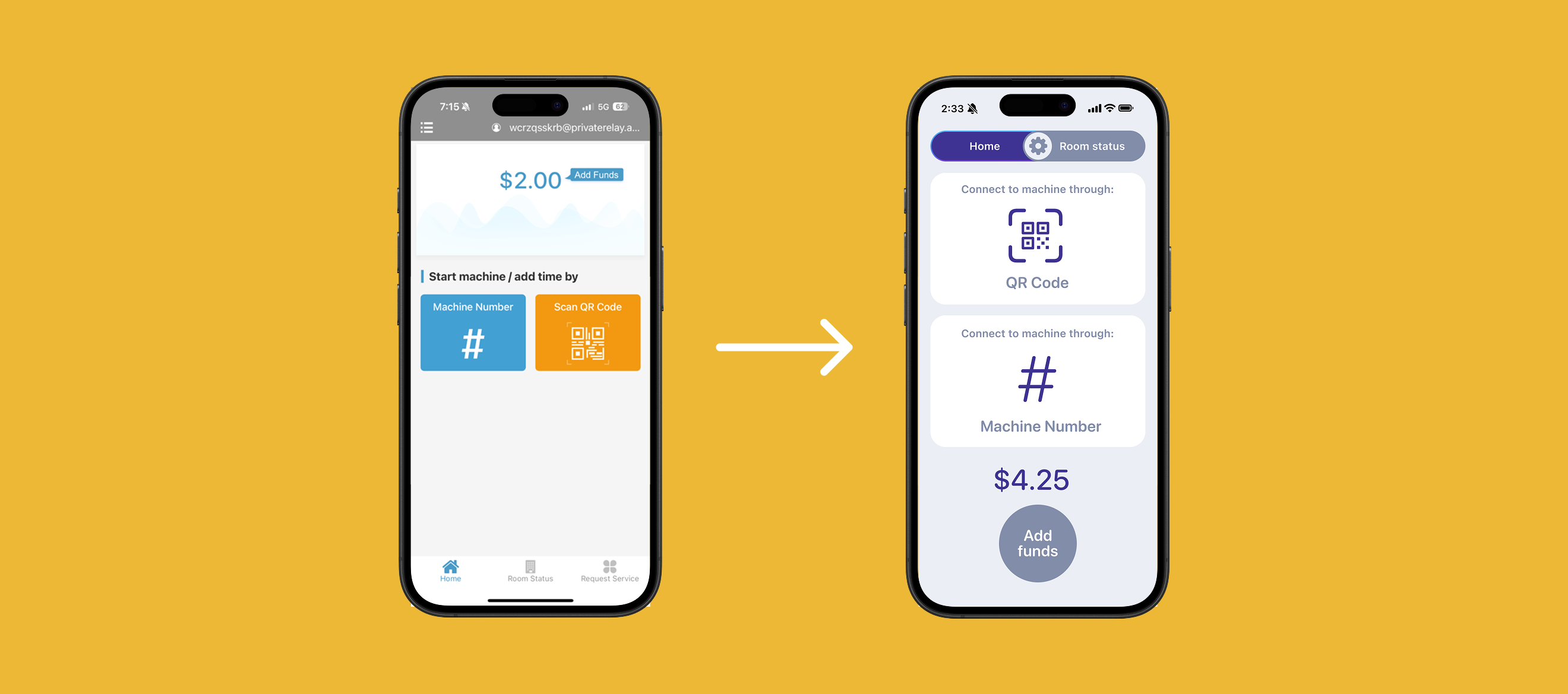
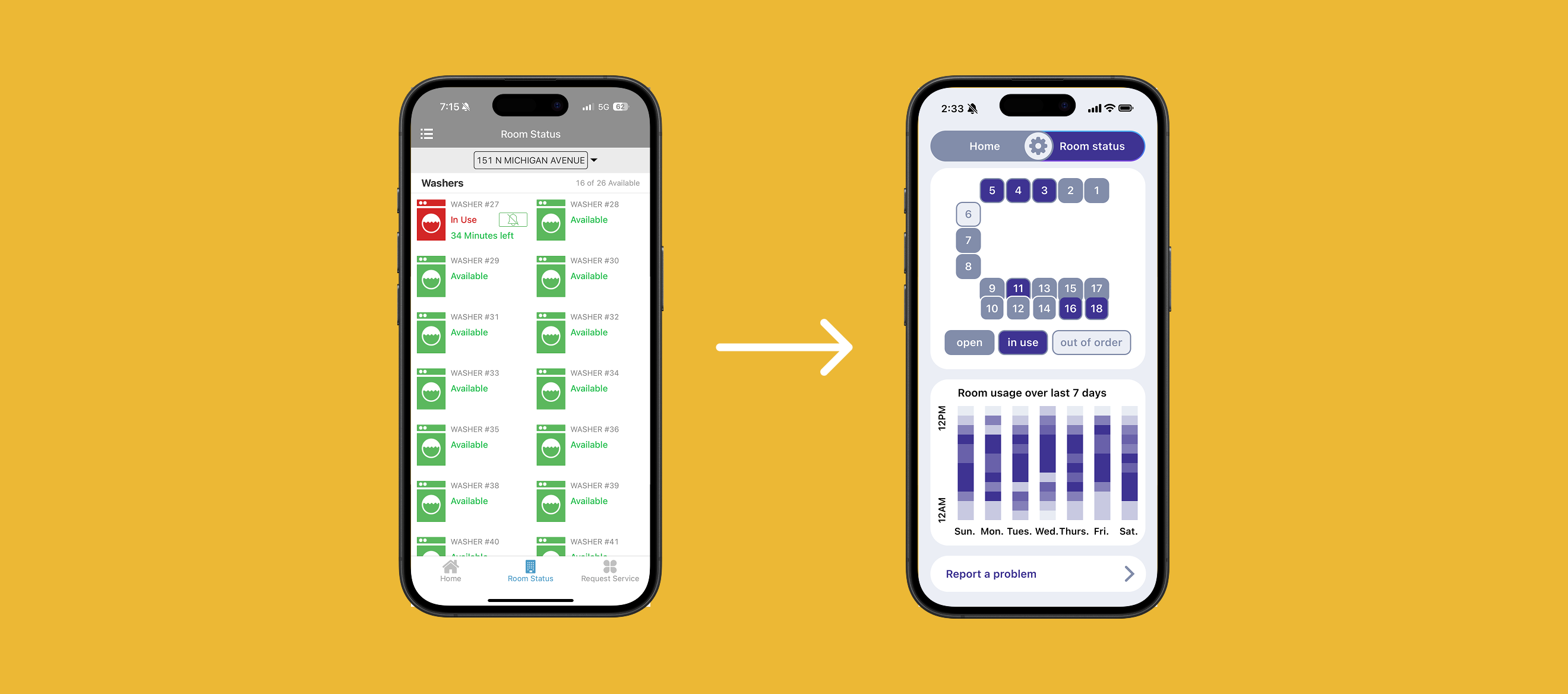
The organizational infrastructure of Family Pride Pay is very unbalanced. The hamburger menu features many links that lead to nowhere, as well as links that are already accessible from the bottom navigation. Some links also lead to blank pages with no meaningful information or features.
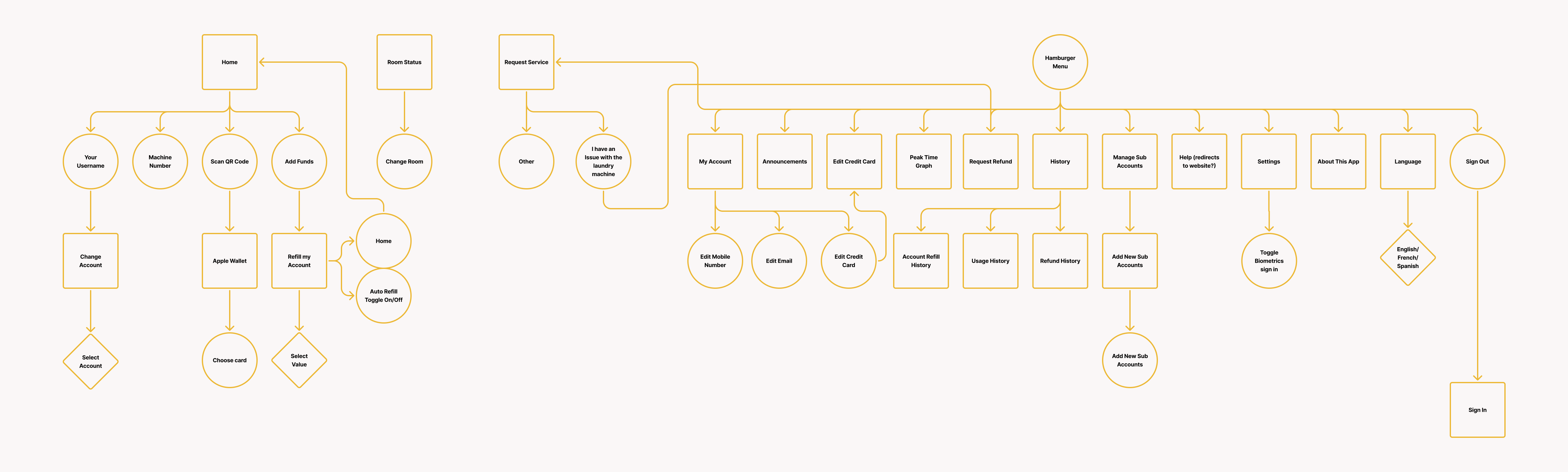
I replaced the main navigation with three sections: home, room status, and settings (which contains most of the options from the hamburger menu). Options to request a refund or to request service on a machine are now located under the Room Status tab.
User Flows
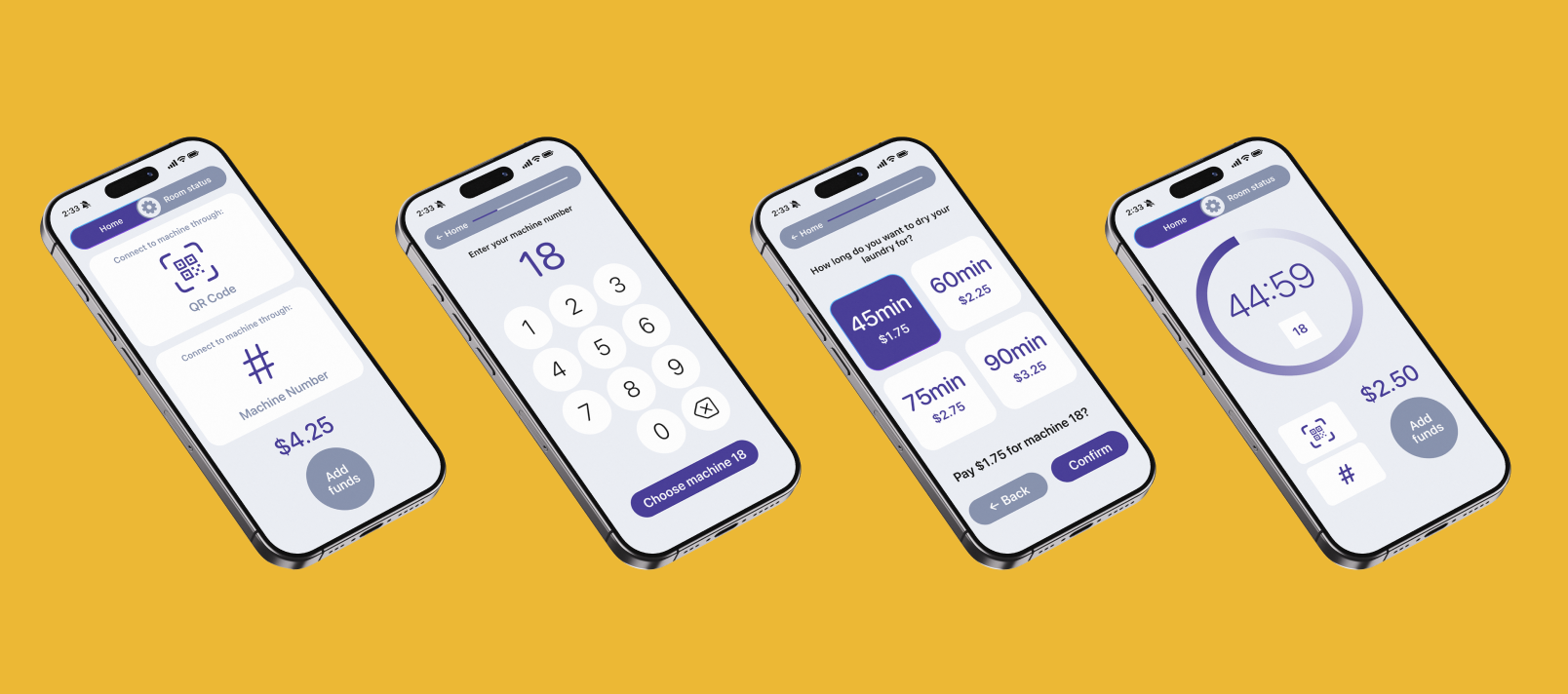
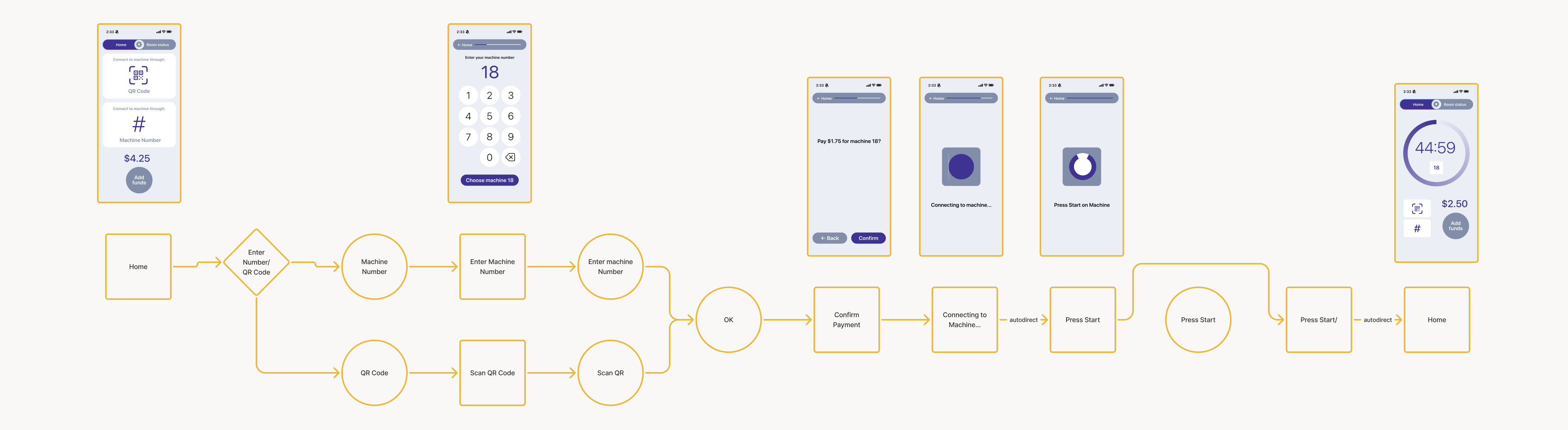
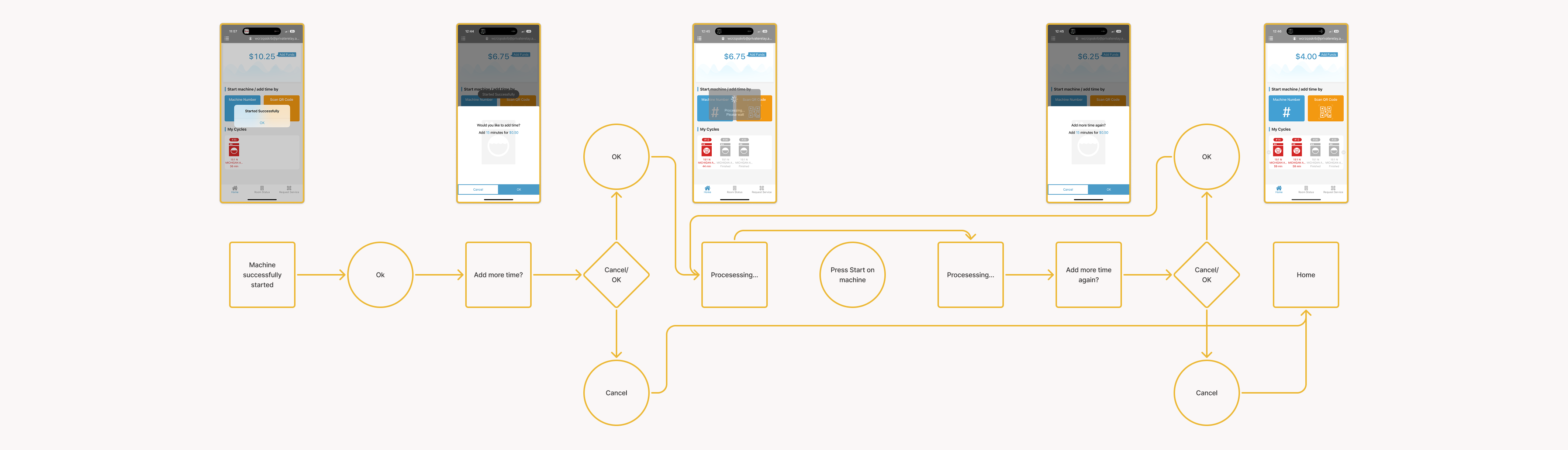
The user flows when trying to pay for laundry contain many points where the app stalls while connecting to the machine, leading to an unnecessarily long and frustrating experience.
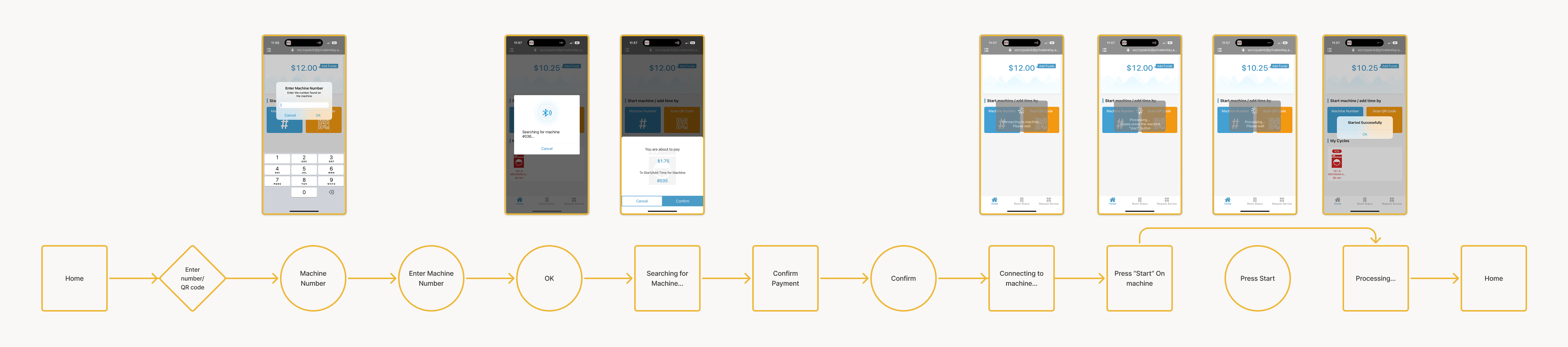
I created new user flows for paying for time, which include only 1 point of connecting to the machine as well as a progress bar for users to see how far along they are in the process of paying for their laundry. During their time connecting to the machine, there is also an animation that plays to entertain the users.
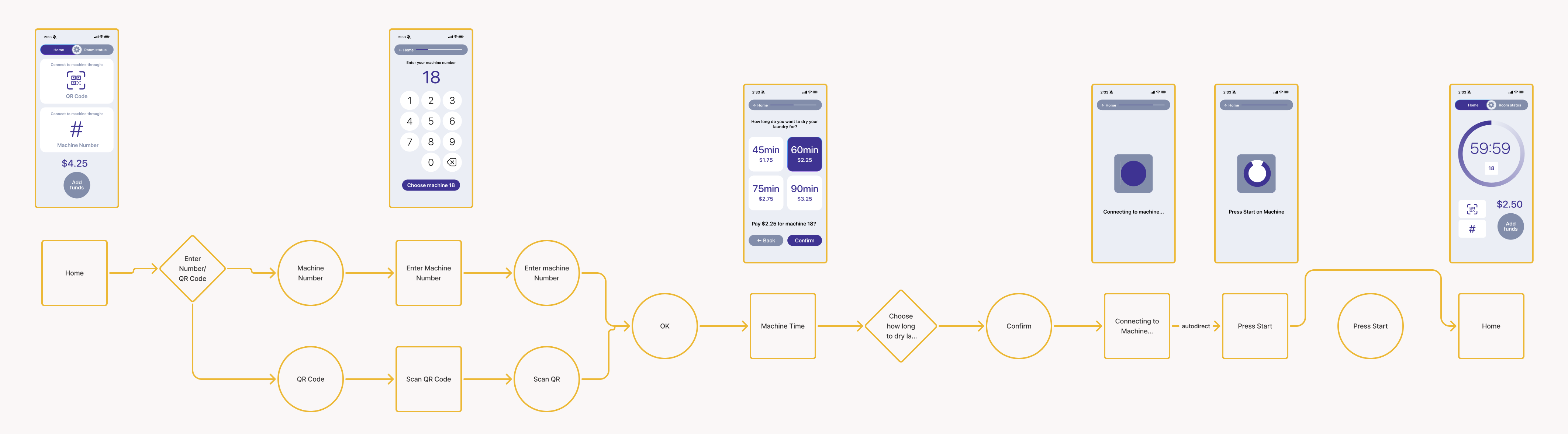
Currently, in order to dry laundry for longer than 45 minutes, the user must add time 15 minutes at a time, and complete a checkout-process for each additional 15 minutes. The user must wait for the app to process with each transaction, which is an inefficient use of time.
I restructured the process of adding and paying for more drying time. Instead of having to click "more time" and waiting to connect to the machine for every additional 15 minutes, users can now choose from a menu of times to dry, which simplifies the checkout process.
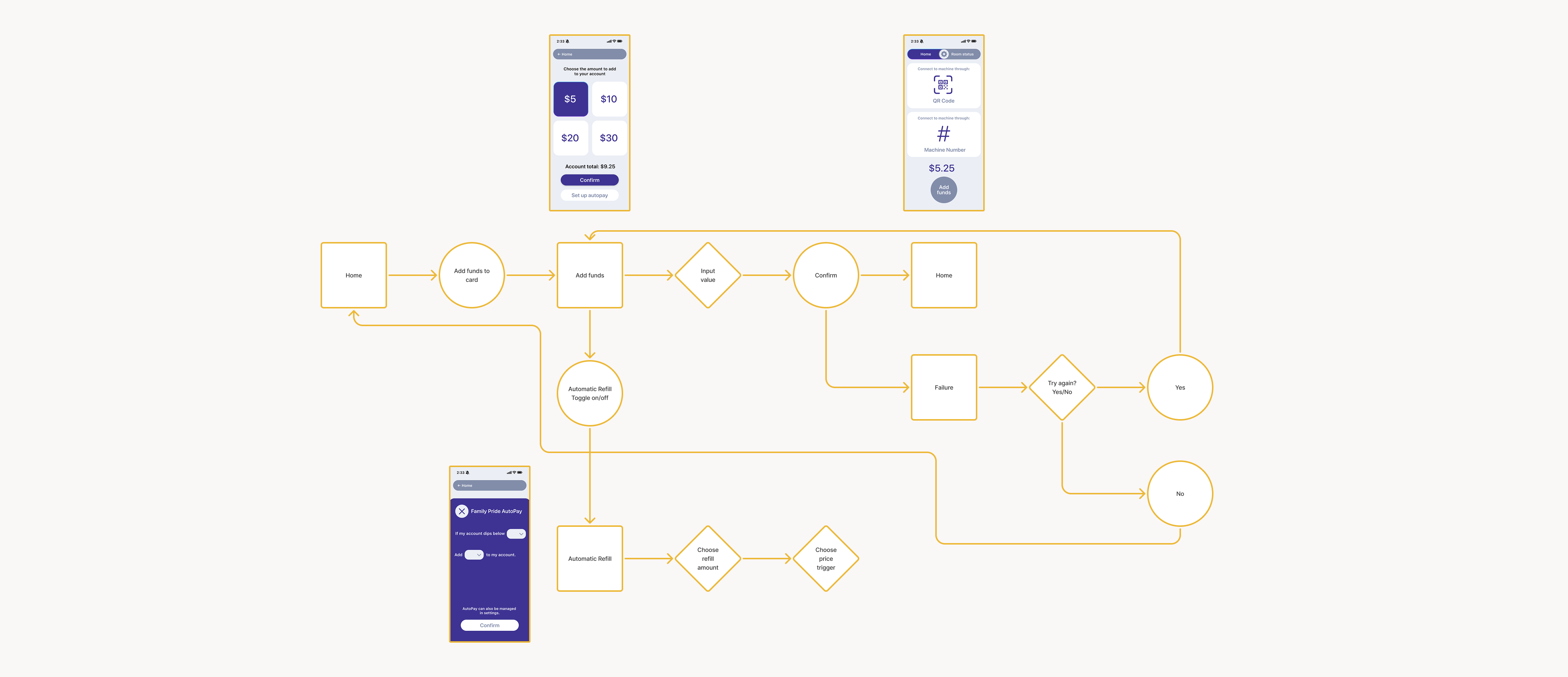
Adding Funds
After adding money to their accounts, users are auto-directed back to the page where they can add funds; if they try to add funds again from the page, they receive an error message.
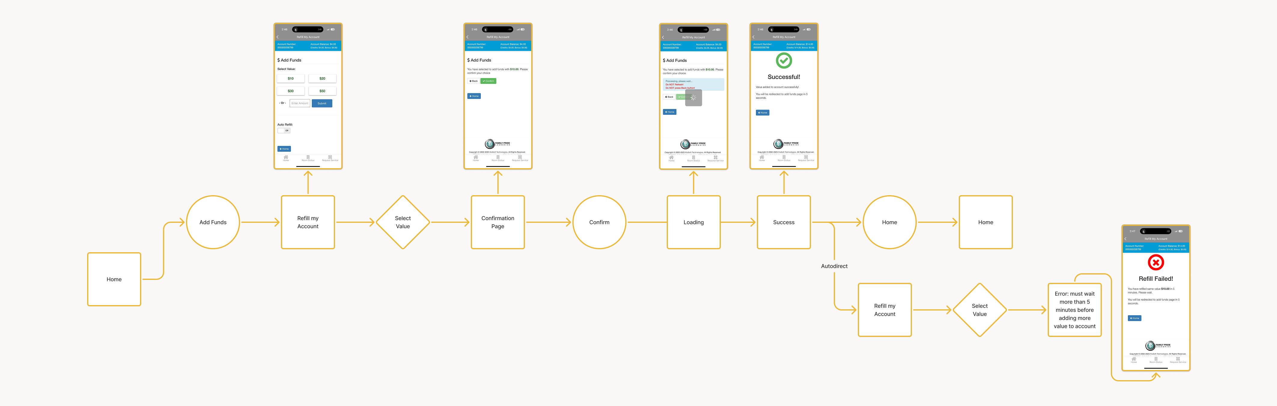
I shortened the process of adding money to the account by prioritizing the fund options and removing the ability to add a custom amount. Choosing the option to set up autopay also opens a popup screen instead of the previous way of text appearing on screen, in order to differentiate it from the normal way of adding funds. After successfully adding funds, users are redirected back to the home screen.
Conclusions and Screen Gallery
As a result, Family Pride Pay is now easier to navigate and faster to use. The new UI is offers a more cohesive color scheme and larger, easier-to-read text. Overall, the app is now simpler easier to use, which will increase user satisfaction and company profit.